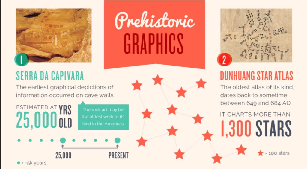
Many histories of modern infographics begin with the work of William Playfair in the late 18th and early 19th centuries. Arguments can be — and have been — made for much, much earlier examples. Even cave drawings and hieroglyphics are considered by some to be examples of infographics.
But the word “infographic” (or “infographics”) is much more recent, making its earliest appearance in the early 1960s, a few years later than the related word “infograph”. That’s earlier than either OED or Merriam-Webster cite for the first appearance of the word.
Here’s how the OED and Merriam-Webster define “infographic”:
OED: Now chiefly journalism; a visual image such as a chart or diagram used to represent information or data in an easily understandable form
Merriam-Webster: a chart, diagram, or illustration (as in a book or magazine, or on a website) that uses graphic elements to present information in a visually striking way
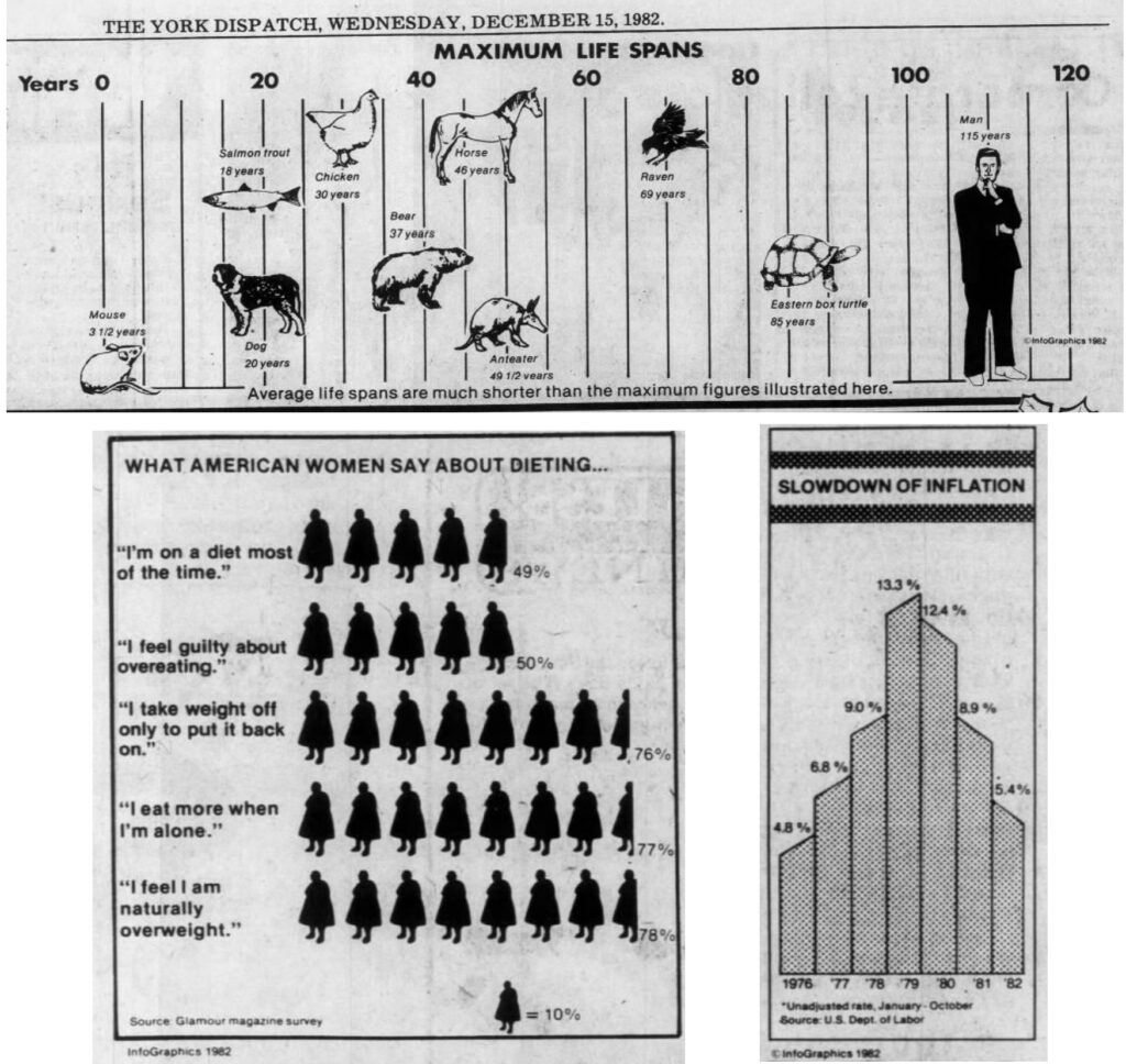
That use of the term appears first appeared in 1979 and gained widespread use with the syndication of graphics carrying the name InfoGraphics that began appearing in newspapers around the U.S. in December 1982.
I’ll have more on the 1979 first use and on these syndicated infographics, but first let’s look at the earlier uses of the term and its predecessor “infograph.”
The Hammond Infographs
The earliest appearance I’ve found of “infograph” in print is in a 1957 newspaper article about a map study program in a third grade class at a Naugatuck, Connecticut, school. (“Simplified Study of Maps Made in Grade Three, Salem,” Naugatuck News, March 15, 1957, p2.) It describes children bringing “articles from home on which maps played a part” including one boy who brought in “an infograph of the United States.”
I managed to track down the former student and wrote to him, but received no response. (It’s unlikely he’d remember what he brought to school on that day 64 years ago, but it was worth a try.) It’s likely that his infograph was one produced by the C.S. Hammond company called the “Hammond United States Infograph: Facts and Figures at a Glance.”
I bought a copy on eBay of this Hammond infograph, which was mentioned in an Ohio newspaper as early January 1958 and widely noted in ads and news stories across the U.S. by 1959. It’s a two-sided device, approximately 53/4″ x 85/8″ with an inside piece that can be slid up and down to display information about each of the 50 states — name, nickname, capital, population, area, state flower, state bird, and date admitted to the union — in cut-out windows.
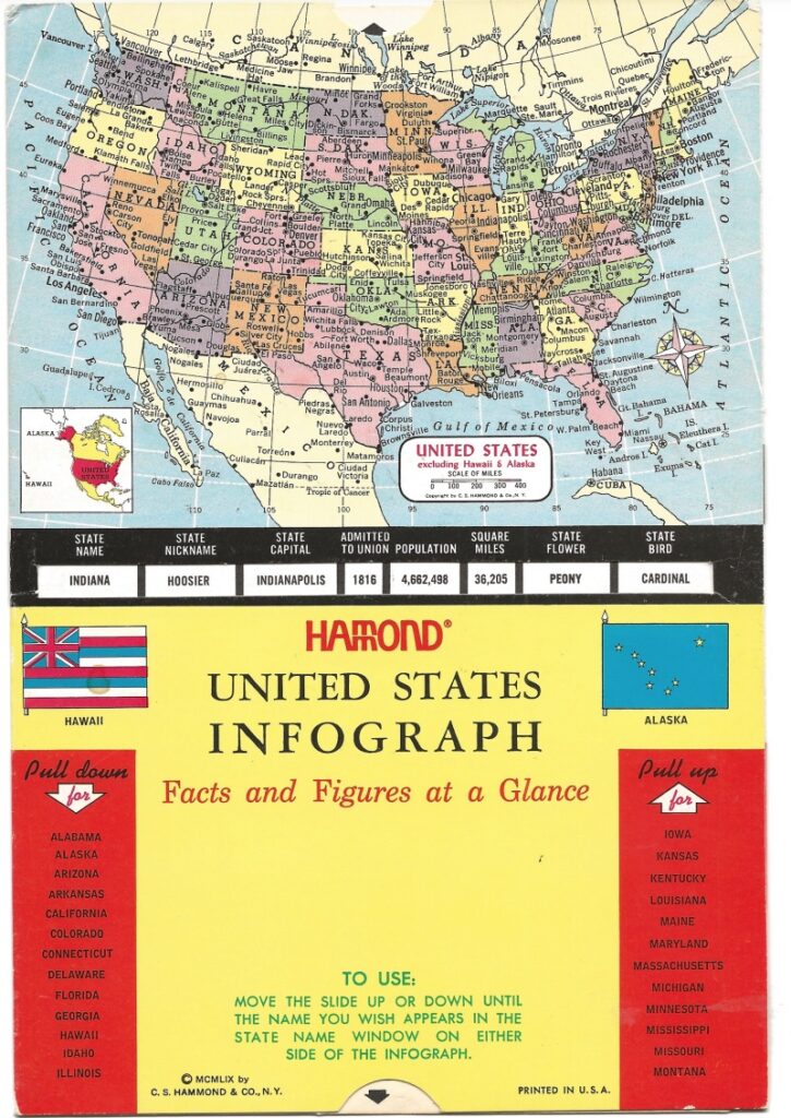
It’s a fun item (and a nice complement to my own collection of thematic and other atlases), but it’s not an infographic as we think of them today. Hammond produced other such infographs in the 1950s and 1960s, including ones on countries of the world, the planets, and big game animals of North America.
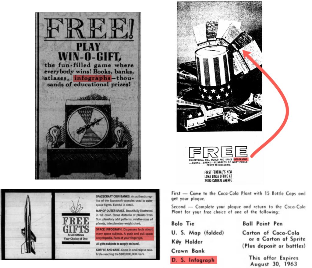
The Hammond infographs were sometimes given away as premiums, as seen in these advertisements.
Sports, Space, Dance, and Practical Tools
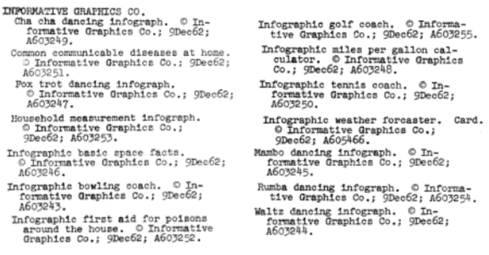
In December 1962, an Illinois company called Informative Graphics Co. had 14 items copyrighted. Seven of them had “infographic” (as an adjective) in their titles. That’s the earliest example of the word that I have found. Another six were called “infographs,” like the Hammond products.
The topics of these items copyrighted in 1962 vary widely. The “infographic” entries cover sports (“bowling coach,” “golf coach,” and “tennis coach”), practical information (“miles per gallon calculator,” “first aid for poisons around the home,” and “weather forecaster”), and space (“basic space facts)”. Five of the “infograph” entries are about different types of dances (cha cha, fox trot, mambo, rumba, and waltz). There’s one on “household measurement.”
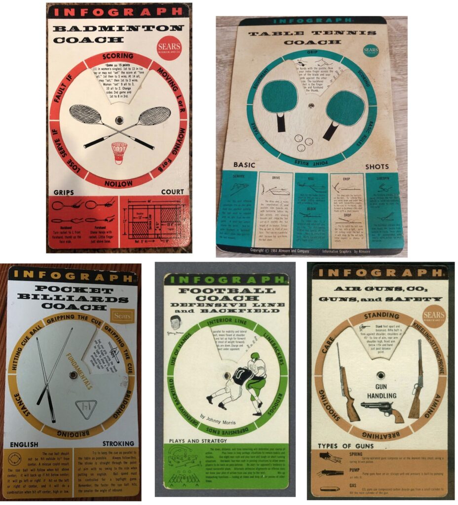
I have not found copies of these early products, but the company — known later as Infograph Incorporated and Atmoore and Company — produced many more of these infographs over the next few years. Like the Hammond examples, they used a sliding or turning mechanism to display changing information in small windows. Most appear to have been distributed via Chicago-based Sears Roebuck and carried a Sears label in addition to the Infograph or Atmoore name.
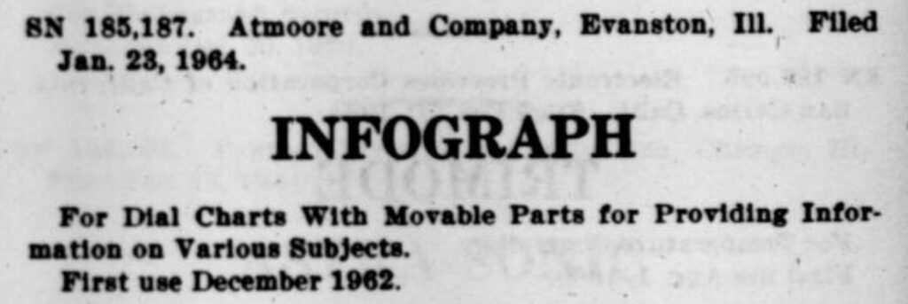
In January 1964, Atmoore and Company applied for a trademark on the name Infograph, described as being used “for dial charts with movable parts for providing information on various subjects”. The application, as listed in the Official Gazette of the United States Patent Office, was posted to allow 30 days for others to register opposition to its being granted,
It’s not clear if there was opposition (perhaps from Hammond) or if the trademark was granted. But in 1966 the principals in the company, Jerome T. Atkinson Jr. and Elliott M. Moore, were granted a patent (filed in April 1964) for a process for manufacturing a “dial indicator.” Their application — it didn’t use the word infograph — noted that a cost-effective way of manufacturing such products would be valuable “inasmuch as these indicators are often given away.”
This company, which introduced the word “infographic” and produced infographs, does not seem to have lasted past the mid-1960s. The words “infographic” and “infographics” popped up in other places in the 1970s, but — like the Atmoore examples — were not really what we think of as infographics today.
Newspaper Syndication: PICK-S Graphics and Newsgraphs
Like infographics in general, infographics in newspapers were around before the word itself was used. Packaged and syndicated examples helped spread them to papers that didn’t have an in-house capability of producing news-related graphs, charts, diagrams, and illustrations. (In a 1934 survey of Oklahoma newspaper editors by the University of Oklahoma School of Journalism, “newsgraphs” was one of the categories of ready-to-print publicity material the editors said they would be interested in.)
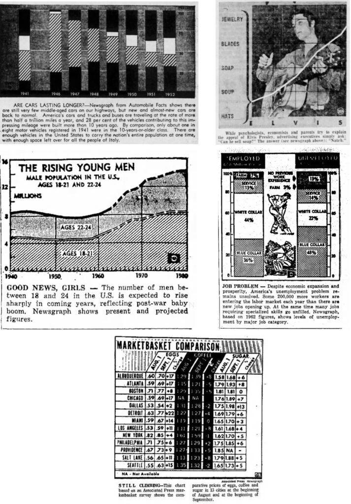
An early source of branded newspaper data-based graphics was a New York firm called PICK-S. The two principals, Franz Pick and Joachim Silbermann, were primarily economists and investment advisors, but they produced a wide variety of graphics in the 1940s, most of them on the economy or the war. Labelled “GRAPHIC BY PICK-S,” they appeared in trade magazines and government reports and in newspapers around the U.S.
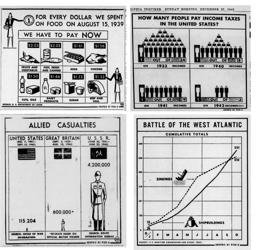
In the 1950s and 1960s, some newspapers referred to these kinds of graphics (syndicated by then from several sources) as “newsgraphs,” the term that had been mentioned in the Oklahoma survey in 1934.
“Infographics” in the 1970s: The Influence of Computers
The word “infographics” began to be used again in the 1970s, usually tied to the growing use of computers. But, as with the Informative Graphics examples from 1962, these uses did not carry the same sense that is attached to the word today.
- “Infographics” was the theme of the American Bankers Association’s National Automation Conference held in San Francisco in 1970.
- One year later, the National Microfilm Association had “Infographics Update” as the theme of its conference in Washington.
- A British electronics and computer company called Ferranti International had a Ferranti Infographics division making CAD/CAM systems as early as the 1970s.
- There was a short-lived Dallas-based company called Infographics, Inc. in the mid-1970s.
- A 1976 book published by the Gerontology Center at the University of Southern California described “an infographic model of media access for elderly advocate organizations.” It described infographics as being concerned with “how systems operate within their information environments….”
In 1979, the author Eric de Grolier, in his book The Organization of Information Systems for Government and Public Administration, used the term to mean “ways of obtaining diagrams and maps from a computer.”
It should be noted that we have referred to information rather than documentation. In point of fact, the decision-maker is more interested in substance than in the form it takes. It matters little if it is a printed or stencilled document, a computer list, a diagram, map or photograph, although, all things being equal, he would prefer the most succinct. As Napoleon once remarked, ‘the roughest sketch tells me more than a lengthy speech’. This explains the relevance of graphic semiology and ways of obtaining diagrams and maps from a computer (infographics).
Eric de Grolier, The Organization of Information Systems for Government and Public Administration (1979), p38
That 1979 use is the one cited by OED as the earliest use of the word. Merriam-Webster presumably has the same quote in mind when it gives 1979 as the earliest use of the word with its present meaning.
InfoGraphics: Widespread Syndication
As noted at the beginning of this long exploration, the use of the word “infographics” in its current sense really took off with widespread syndication of data-driven graphics with the name InfoGraphics in the early 1980s. Taking advantage, no doubt, of the growth of computer graphics programs, the InfoGraphics service was able to produce infographics in greater volume, variety, and quality than predecessors like PICK-S.
These InfoGraphics were a product of the Field Newspaper Syndicate, founded by Chicago Sun publisher Marshall Field III and better known for its syndication of comic strips. A Field Syndicate editor, reported the trade magazine Editor and Publisher in a 1983 year-end review, “said tv and USA Today have increased newspapers’ interest in using illustrative material such as that provided by his syndicate’s ‘InfoGraphics.'”
(A search of the Newspapers.com database shows the number of these in U.S. newspapers more than doubled between 1983 and 1984.)
The syndicate’s InfoGraphics continued to appear in newspapers into the early 1990s. (The name of the syndicate changed to News America Syndicate and then North America Syndicate following its sale first to Rupert Murdoch’s News Corporation and then to the Hearst Corporation.) The Knight Ridder Tribune news service (a merger of the services of Knight Ridder and the Tribune Company) had its own syndicated infographics operation beginning in the late 1980s.
By then, the word had come into common, generic use. There were awards for newspaper infographics and ads for positions creating them in newspapers and elsewhere.
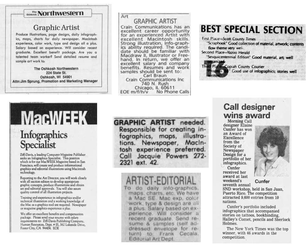
Newspaper editors commented on the rise of infographics. In January 1985, Alan Moyer, managing editor of the Arizona Republic, in a review of the year just concluded wrote: “Color exploded as never before, in photographs and infographs, a once obscure word now commonly used, describing a variety of maps, graphs and animated drawings.” (“Report to Our Readers,” January 6, 1985, p9)
Four years later, Lawrence Beaupre, vice president and executive editor of the Gannett Westchester Newspapers, wrote about the evolution of news graphics. (I was a reporter for one of those papers in my first job after college, several years before Beaupre arrived.)
[T]he modern news artist is as much at home with a computer as with a brush and drawing table …
These newsworthy drawings have come to be known as ‘info-graphics’: that is graphics whose primary reason is to provide information.
… The charts in our Business Monday section, the weather maps on Page 5A every day, the maps accompanying local, national, and world stories, the charts and graphs mentioning trends in stories — all of these are designed to help readers grasp the news quickly and understand it better
“Graphics Draw Readers to News Stories,” Herald Statesman (Yonkers, NY) and other papers, May 28, 1989, p B2
One thing I have not yet been able to discover is when the word “infographic” was first added to OED, Merriam-Webster, and other dictionaries. I’ll keep trying to find out. In the meantime, it seems appropriate to end with this whimsical infographic by Grammarly and Merriam-Webster on the M-W website on “How a Word Gets into the Dictionary.”




Ken, you are the Indiana Jones of etymology — intrepid, undaunted, stepping where other lexicographers fear to tread,